Interface Settings Properties Panel
Use the Interface Settings Properties panel to specify settings and styles for interface, template, and story pages (see Story Settings Properties Panel for story specific content).
To open the Interface Settings, switch to Edit mode and click on an empty space in the model. (If you've closed the Properties panel, you'll need to double-click, or slide it out with the  button appearing at the right of the application.)
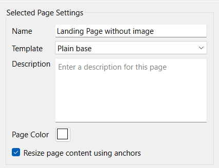
Selected Page Settings
These apply only to the page you're currently editing.

- Name - specifies the name of the current page. The default is simple Page 1, Page 2, and so on. This can be useful for remembering which page is which, but doesn't affect the published simulation.
- Template - specifies the template to use for this page. Select a template from the dropdown. The content of the template will be visible and active when published or in Explore or Presentation mode. In Edit mode, the template content will not be selectable or editable. To edit it, go to the template page itself. Select No Template in the dropdown to remove the template page.
- Description is a brief description of the page. This will be displayed when hovering over pages in the Pages Panel (Interface) and can make it easier to tell what pages are for when the thumbnails are small. It can also be used for comments.
- Page Color - click to choose the default background color for the page being edited.
Note: The page color is set separately for each page, and will override any page color set in a template.
Note: In stories, the page color only applies if the model view is left transparent.
Note: The page color on a Template Page will not be used in pages the template is used in. It's there only to allow experimentation with different background colors when developing template content.
- Resize page content using anchors - will cause the page content of the published interface to adjust position when the page is resized. This option is not available if Zoom (the default) is used for resizing. For more detail see Resizable Interfaces.
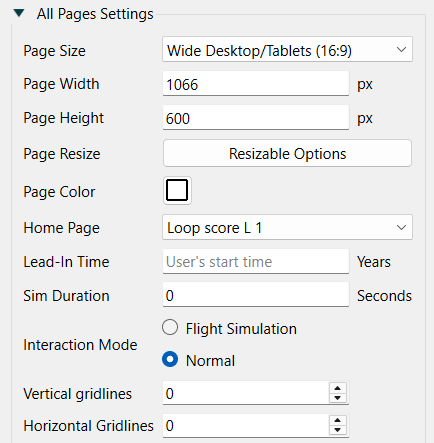
All Pages Settings
These settings apply to all pages in the interface.

- Page Size allows you to choose a page size to display the interface at. There are several predefined options that should work well with different types of devices.
- Desktop/Tablets (4:3) will work well for most computers and tablets. The implied width and height of 800 x 600 is small enough to typically not need any scroll bars, but big enough to fit a reasonable amount of content.
- Wide Desktop/Tables (16:9) will work well with wide screen devices and HDTV monitors. The implied width and height of 1066 x 600 may leave vertical space or require horizontal scrollbars on other devices.
- Mobile Portrait will work well on most phones (when used upright). The implied width and height of 1245 x 700 will normally be automatically scaled so that little scrolling is needed.
- Mobile Landscape will work well on most phones (when used sideways). The implied width and height of 700 x 1245 will normally be automatically scaled so that little scrolling is needed.
- Custom allows you to set the page width and height directly. You don't actually need to select Custom, just fill in values and Custom will automatically be selected.
- Page Width, Page Height - select the width and height for a page.
Note when you resize the page all page elements will be scaled based on the new size relative to the old. This may change the appearance of objects if the aspect ratio is substantially different between the old and new sizes.
- Page Resize - click on Resizable Options to open the Resizable Options dialog. This will allow you to specify how the user will experience the pages on difference devices. See Resizable Interfaces for more discussion.
- Page Color - click to choose the default background color for all pages. This can be overridden for a specific page, below.
- Home Page specifies the page the interface will start on when launched from the web (when entering presentation mode, it starts on the page you're on). The default is the first page.
- Lead-In Time determines how much of the simulation runs before the user can change inputs. Starting part way through the simulation can be helpful when the display of partial results from predefined decisions is helpful background for interface users. When published, and in presentation mode, the model will always start at the lead-in time - that is no empty graphs or tables will ever appear even after restoring output. In experiment mode, the lead-in time will be used for a Start New Run command (Actions (Interface)) and a Run command when there is a pause interval is set.
- Sim Duration determines how long (in seconds) the simulation will take when the user asks for a run. Use 0 to run as quickly as possible. Experiment to get the results you desire.
- Interaction Mode determines what happens when the user changes a slider, knob, or any other input control (including typing in a value) while a simulation is running. If Flight Simulation is checked, the simulation will continue using the new value. If Normal is checked, the simulation will pause, and require the user to resume the simulation (using a Resume, Advance, or Run action).
- Vertical Gridlines, when nonzero will add light gray vertical lines to the background of the interface pages. This can be helpful for aligning objects.
- Horizontal Gridlines, when nonzero will add light gray horizontal lines to the background of the interface pages. This can be helpful for aligning objects.

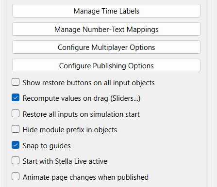
- Manage Time Labels Click on this to open the Manage Time Labels dialog box. This will allow you to set up and customize the labels that will be used for time in tables and graphs including setting up date formats.
- Manage Number-Text Mappings Click on this to open the Manage Number-Text Mappings dialog box.
- Configure Multiplayer Options will open the Multiplayer Options dialog allowing you to set your interface up to work in a multiplayer setting.
- Configure Publishing Options will open the Publishing Options dialog allowing you to set up authentication, data collection and server side computation.
- Show Restore button on all input objects - use this to have a restore button appear whenever an input object is used to control a variable. If this is checked, a small restore button (
 ) will appear when the interface user changes a value.
- Recompute values on drag (Sliders...) - use this to have draggable controls (Sliders, Knobs, Sketchables and Pie Inputs) change values as they are adjusted. In Stella Live this will trigger a new simulation and when paused or on a new run the values of flows and converters for the current time will be recomputed. If it is not checked, the controller parameter will be changed only after the user has finished the drag (released the mouse), nothing at all happens during the drag. This setting also appears on the Model Settings Properties Panel where it is labeled "Stella Live update on drag."
- Restore all Inputs on Simulation Start, if selected, causes the any interactive inputs to be restored when a new run is started via the Start New Run or Run commands (but not when using the Simulate or Advance Time in Ballistic Mode commands). This is convenient in multiplayer games where each new run is best started from base decisions, and also helpful for runs that start with historical inputs then shift to user inputs.
- Hide module prefix in objects - check this box to have names in graphs and on tables be displayed without their module prefix (that is, as Population instead of Demographics.Population). Note that if you've specified a display name for a variable, this option will have no effect, as the display name itself is always used.
- Snap to Guides - check this box to turn on guides. If checked, guides will appear when you move objects around the model. They allow you to align one object's center or edge with that of another.
- Start with Stella Live active - check this box to open your interface with Stella Live already active. This is useful for interfaces where the entry page allows people to change inputs and see results without needing to go through an opening page. You can still turn Stella Live on and off with button actions, but it can simply be left on at all times with no button actions required.
- Animate page changes when published - check this to create a animation between pages. This is the default behavior prior to version 2.1.5, but will not be visible on all interfaces.
All Pages Style

Lets you specify the font face, size, color, and decoration that will be used on objects placed on pages. You can override this for any individual object using the styles panel for that object.
![]() button appearing at the right of the application.)
button appearing at the right of the application.)