Place a button on the interface in order to allow the user to take actions, including simulating the model and navigating to other pages. To place a button, select the ![]() on the Interface Build toolbar, and click on the page where you want the button to appear. A button can execute a number of Actions (Interface).
on the Interface Build toolbar, and click on the page where you want the button to appear. A button can execute a number of Actions (Interface).
You can control the text or picture that the button displays, and the actions that are taken when the button is pressed.

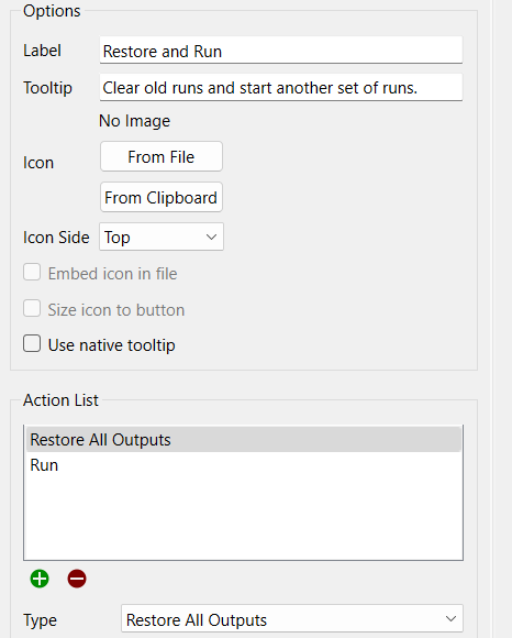
Use these to set the text or picture that the button displays.
Label is the text that will be displayed on the button. If you leave this blank, the text associated with the first button action will be displayed, unless you've specified an icon.
Tooltip is displayed when the user passes the mouse over the button ( ).
).
Icon specifies the picture that will appear in the button. If you don't specify any picture, the button will appear as text on a solid background, with shading.
Icon Side determines on which side of the text the picture will be shown. This is only applicable if you've entered text and selected a picture for the button.
Embed icon in file, if checked, will embed the picture you've selected into the model file when it's saved, and there will be no reference to the original file. If this is not checked, you should keep the original file in the same directory as the model file or a graphics subfolder.
Size icon to button, if checked, will make the picture fit in the button. If this is not checked, the picture will be centered in the button, and either clipped or drawn on top of the button surface used for text, giving effects such as: 
Use native tooltip, if checked, will use the tooltip native to the browser. Native tooltips will generally be smaller, but may vary from browser to browser.
This is the list of actions that will be taken when the button is clicked. Some of the available actions have additional parameters and are discussed in detail in Actions (Interface)
If an action isn't viable (for example, a stop simulation action when the simulation is already stopped), the action will be skipped when the button is clicked. If there are no viable actions in an action list, the button will be disabled, and enabled only when an action becomes viable (when, for example, a simulation is started).
You can use the optional conditional section to have actions taken only when the specified conditions are met. The most important use of this is navigation, where specifying a set of exclusive conditions will make the button switch to a page based on the current value of a variable (or player number, for a multiplayer game). The condition applies to the currently selected event. You can either specify a variable - the condition is considered to be true if that variable it not zero - or a role defined in the Multiplayer Options dialog.
Variable
To enable based on a variable value, click on
and select a variable, or type into the editing box, and autocomplete will display valid variable names. When you do this, the command will be enabled for everyone, if it isn't already.
Immediately update on user input, if checked, will use the variable value as it would be computed when the model is paused. This allows the actions taken by a button to be conditional on use input during the pause. If this is not checked, the variable value for converters and flows computed at the previous DT (Save Interval) will be used. Note that stocks already have their values set when the model is paused and those will be used regardless of the status of this check box.
Role
To enable based on a role, in a multiplayer game, click on the dropdown box showing Everyone, and select the role to enable the action for. When you select a role, any variable in the editing box will be removed. If you don't have multiplayer gaming set up, the dropdown will be grayed.
Determines whether the object is visible. See Object Visibility (Interface)
You can control the appearance of the button using the Styles Tab to change font and color. In addition, you can set the border style that will determine