Use a span slider to adjust two input values in your model by dragging its two thumbs (handles) from side to side.
You can control the size and color as well as the range over which a span slider operates. Span sliders can be used with any model variables, but are intended for two variables that are naturally paired with the most common use case being for sensitivity simulations on the interface. The span slider works largely the same as the Slider (Interface) it just has two thumbs (handles).
For more information about placing and editing sliders, see Working with Objects.

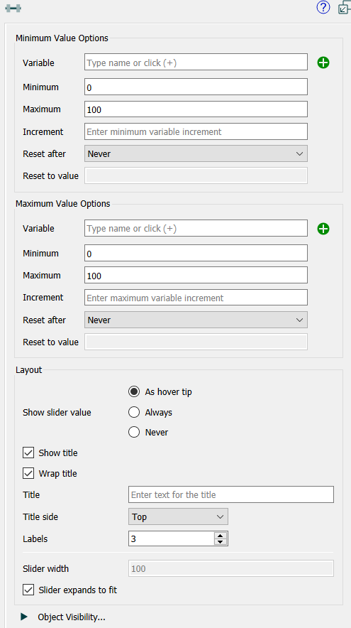
Variable specifies the variable the thumb will control (left thumb for minimum and right for maximum). Begin typing and autocomplete suggestions will appear, or click on the ![]() , then select the variable you want from the find dialog that appears.
, then select the variable you want from the find dialog that appears.
Minimum specifies the minimum value the thumb will take on.
Maximum specifies the maximum value the thumb will take on.
Increment specifies the amount the thumb will change as it's dragged.
Reset After specifies the time after which the user set value will revert to the "Reset to value" specified below. If this is Never (the default), the value won't reset.
Reset to value specifies the value the variable controlled by the slider will take on after the "Reset after" interval specified above (since the slider was set) is passed.
Note The two thumbs should be set so that the minimum value of left thumb is less than or equal to the minimum value of the right thumb and the same for the maximum values.
Note Values can overlap completely or not at all. If the user tries to drag the left thumb past the right it will simply stop. The right thumb needs to be dragged to the right first. Similarly dragging the right thumb to the left.
Show slider value determines whether, and when, the user will see the value of the slider as it is being dragged. This value will be displayed above the slider handle ( ).
).
As hover tip will display the slider whenever the mouse is in the vicinity of the slider, including while dragging.
Always will always display the value.
Never will never display the value.
Note Though this value can be set for each slider individually it is best to set all sliders in an interface consistently.
Note Span Sliders will always be stylized and horizontal.
Show title, if checked, specifies that text should be displayed with the slider. If you want to customize the label position you can uncheck this option and use a text box to place a label.
Wrap title, if checked, will wrap the title in order to allow more room for the slider proper.
Title specifies what text will be displayed if the "Show title" checkbox is checked. If blank, nothing will be shown.
Title side specifies which side of the slider the text should be displayed on. This only matters if the check box for "Show title" is checked.
Labels indicates the number of labels the slider should display.
Note You can set the number of labels to 0 and then use a text box for qualitative value displays.