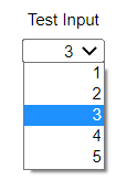
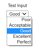
A dropdown input presents the interface user with a list of values to choose between as in:


The second using a number-text mapping as defined in Manage Number-Text Mappings dialog box.
Note For both of the above examples the input values are just 1,2,3,4,5.
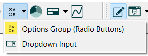
Select Dropdown Input![]() from the Interface Build toolbar (it appears just below the Options group object)
from the Interface Build toolbar (it appears just below the Options group object)
 ,
,
and click on the page at the location you want it to appear. After placing it, you can size it by dragging its sizing handles or using the Properties panel.
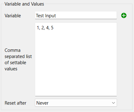
Variable is the variable that the input applies to. Use ![]() to select the variable. Use of wildcard (?) elements is supported for dropdown inputs.
to select the variable. Use of wildcard (?) elements is supported for dropdown inputs.
Comma separated list of settable values is just that, a list of numbers separated by commas - or semicolons if you are using comma as a decimal delimiter.
Note If you set precision in the scales and ranges for a variable be sure that the values you enter do not need to be rounded to match that precision.
Note If the variable takes on a value that is not in the list, a blank dropdown will be displayed.
Reset After determines whether the value entered by the user will be reset to a specified value or simply left at the value set by the user during the remainder of the simulation.
Reset to value specifies the value to reset the input to. It's only used (and not grayed) when Reset After isn't set to Never. The reset value will be displayed when the reset occurs (or blank if it is not in the list).
Note If you use a reset value on a variable that's not a constant, then the reset value, and not the original equation, will be used. To revert to the original equation, the user must restore inputs.
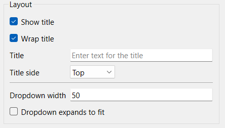
Show title, if checked, will cause the title to be shown. By default this is the name of the variable.
Wrap title, if checked, will wrap the title by putting words on different lines, to try to fit everything in the bounding rectangle created by sizing the object.
Title is the text that will be shown, if blank the variable name will be used.
Title side determines where the title will appear relative o the actual dropdown. The options are Top, Bottom, Left, Right.
Dropdown width is the width in pixels of the dropdown control. This is only visible is the option to expand to fit is not used. When the dropdown is displayed, it will be at least this wide, but may be wider depending on the values being shown.
Dropdown expands to fit, if checked, will size the dropdown based on the size of the object which can be changed by selecting and dragging on the sizing handles, or from the Group Input Styles Tab.
Sets the conditions under which the object is shown as described in Object Visibility (Interface).
Set styles using the Styles ![]() tab as described in Group Input Styles Tab. In addition to position and size, you can specify the Font for the dropdown.
tab as described in Group Input Styles Tab. In addition to position and size, you can specify the Font for the dropdown.