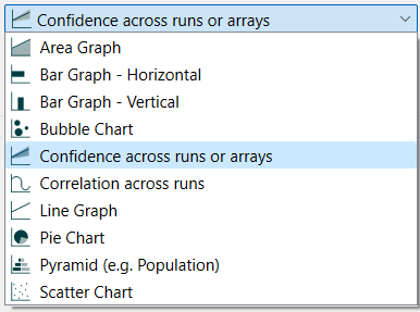
The confidence graph allows you show a spread of values at different times where the spread is either across runs, or across array elements. Rather than the value of a variable, confidence graphs shows statistics on the values a variable takes on across runs or array elements such as the minimum, maximum and median.
Select the graph ![]() from the Interface Build toolbar, and click on the page at the location you want it to appear (you can also add a page to an existing graph you've already put down). On the graph panel, select type Confidence across runs or arrays.
from the Interface Build toolbar, and click on the page at the location you want it to appear (you can also add a page to an existing graph you've already put down). On the graph panel, select type Confidence across runs or arrays.
Then select the variable you want to appear in the confidence chart. You can include any variable you want, but only a single variable. For more information on adding variables, see Graph Series Property Panel
Confidence graphs are normally used to display the range of values realized across sensitivity runs. By arraying your model by a dimension such as run, it is also possible to create a confidence graph for a single run by looking across the array elements for the dimension run. For more information on doing this see Eberlein & Schoenberg (and the model). Though this is not the only way to use confidence across array elements, it is the most common.
If you select * as the array element (and All as the array operation) then the computations will take place across the array elements for the current run (or runs if using comparative). If you select a single element, the computations will take place across the runs, and the option to view comparative results will not be available.
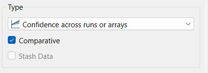
Comparative, if checked, will display multiple runs. Comparative confidence graphs have the confidence bounds drawn on top of each other. This usually works reasonably well then there are only 2 runs being compared, but can quickly become very hard to get information from when more runs are added. Appearance and the ability to interpret are highly dependent on the actual values computed.
Note Comparative graphs use the global graph color sequence for each successive run at different fill intensities. Non-comparative graphs use the global graph color sequence for each successive percentile bound.
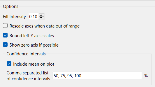
Fill Intensity determines the intensity of shading inside the regions of the confidence graphs and varies from 0 (notthing showing) to 1.0 (solid color). Generally a small, but positive, number will work best here.
Rescale axes when data out of range, if checked, will always show all available data. If this is not checked, and minimum or maximum values have been set for some variables the values may be truncated (their lines will not be drawn outside the specified range).
Round left Y axis scales, if checked, will round the values in the associated Y axis so that the scales are easier to read. If not checked no adjustment will be made.
Note This option does not affect any variable for which an individual minimum or maximum has been specified in either the graph definition or the scales and ranges panel for the variable itself.
The series and display options as well as the styles for the confidence graph are the same as those for other graphs (see Graph Series Property Panel, Graph Settings Properties Panel, and Graph Styles Tab for more discussion).
The colors for the area graph will follow the color sequence set for the model (see Global Graph Styles Properties Panel).